 Features
Use the Date field to present the user with an elegant datepicker, with a Date Format of your choice and lots of customizable options.
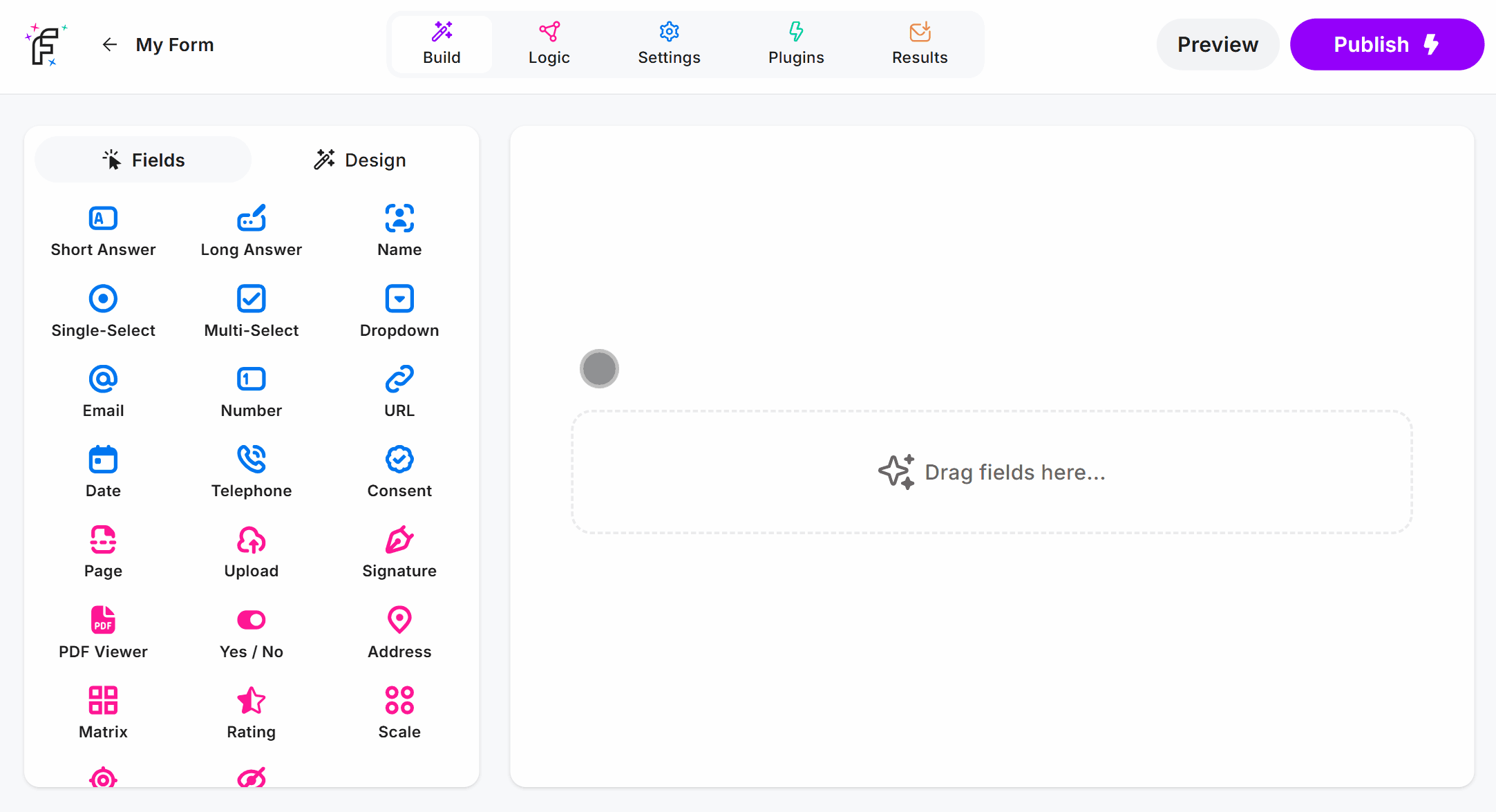
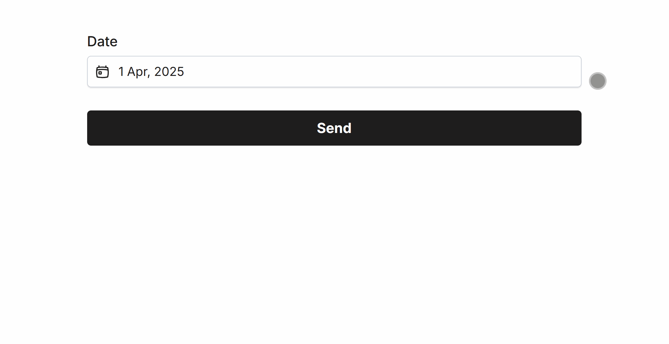
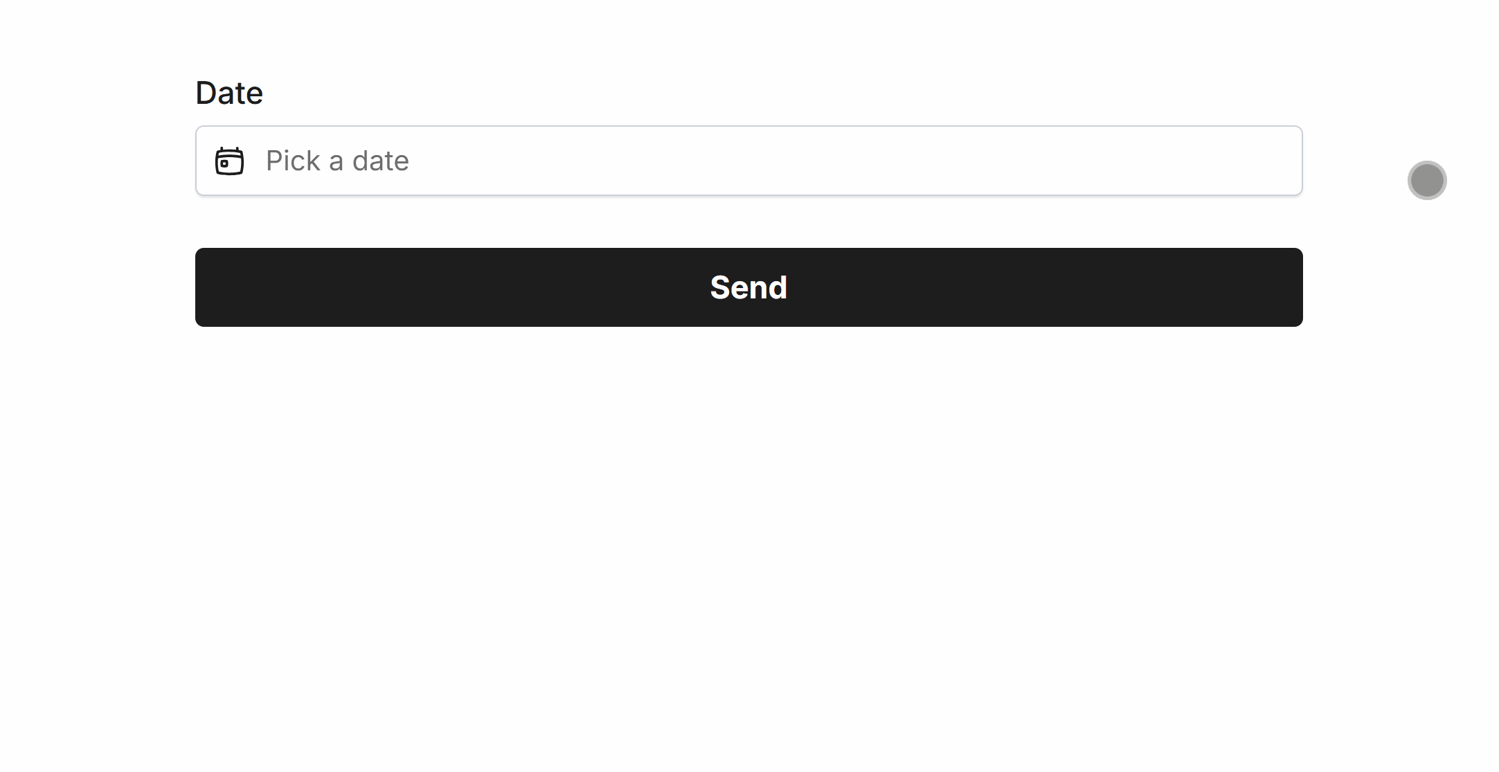
Date Field Demo
Add the Date field and hit Preview or Publish:
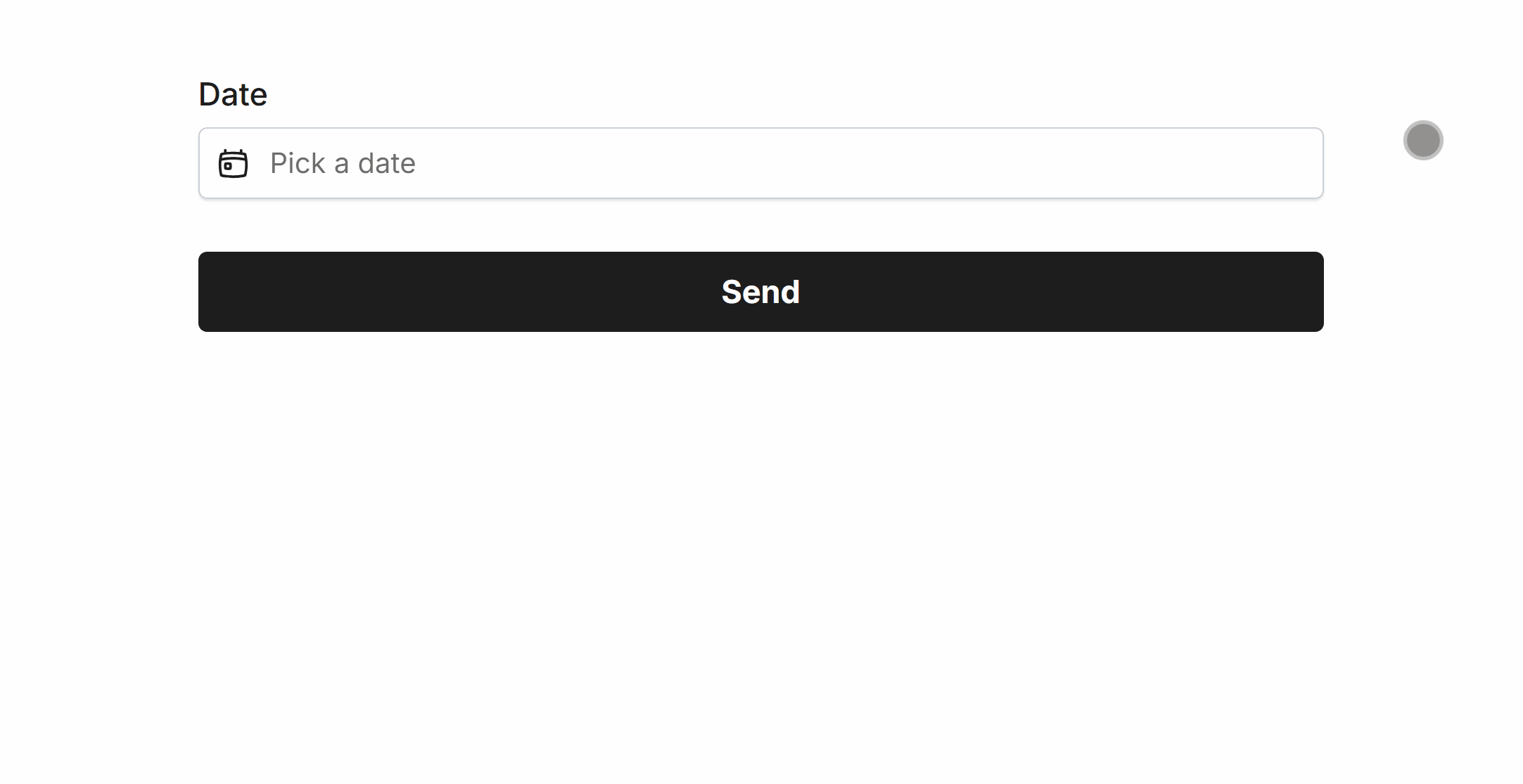
Required Date
Easily make Date required via Smart Validation to ensure the field is always filled out:
Minimum Date
Set a minimum date to prevent selection for a specified date and prior.
Minimum dates can be one-click configured to support dynamic values such as:
YesterdayTodayTomorrow# Days Ago(a number of your choice)# Days From Now(a number of your choice)
 Minimum Date set to ‘Today’
Maximum Date
Set a maximum date to prevent selection for a specified date and after.
Maximum dates can be one-click configured to support dynamic values such as:
YesterdayTodayTomorrow# Days Ago(a number of your choice)# Days From Now(a number of your choice)
 Maximum Date set to ‘Today’
Disable Specific Days
Quickly disable specific days, such as weekends for work related dates or block off days you’re always unavailable:
 Disabling all dates besides Tuesday and Thursday
Disable Specific Dates
Manually add dates to disable from selection, such as 2025-04-11:
 Disabling ‘2025-04-11’ in the Date field
Specific Options
Configuration options specific to this field:
Date Format | Select a visual date format for the form field |
Min Date | Set a minimum date that can be selected in the picker |
Max Date | Set a maximum date that can be selected in the picker |
Enable/Disable Days | Allow only specific days of the week to be selected |
Disable Dates | A comma-separated list of dates to exclude from the date selector |
Common Options
Available on most fields, including this one:
Label | A short description of the field |
Description | An optional longer description of the field |
Required | Enforces the field to be filled in, displays an error if not |
Default Value | Set a default value for the field |
Placeholder | A helpful hint inside the field, e.g. Enter your name |
Read-Only | Locks a field so it cannot be edited, useful when combined with Default Value |
Custom Name | Every field has a unique hidden "name" that can be customized |
The Date field background, selected date, border and text color can be changed within your Theme settings.