 Features
Use the Time field to present the user with an elegant timepicker, with a Time Format of your choice and lots of customizable options.
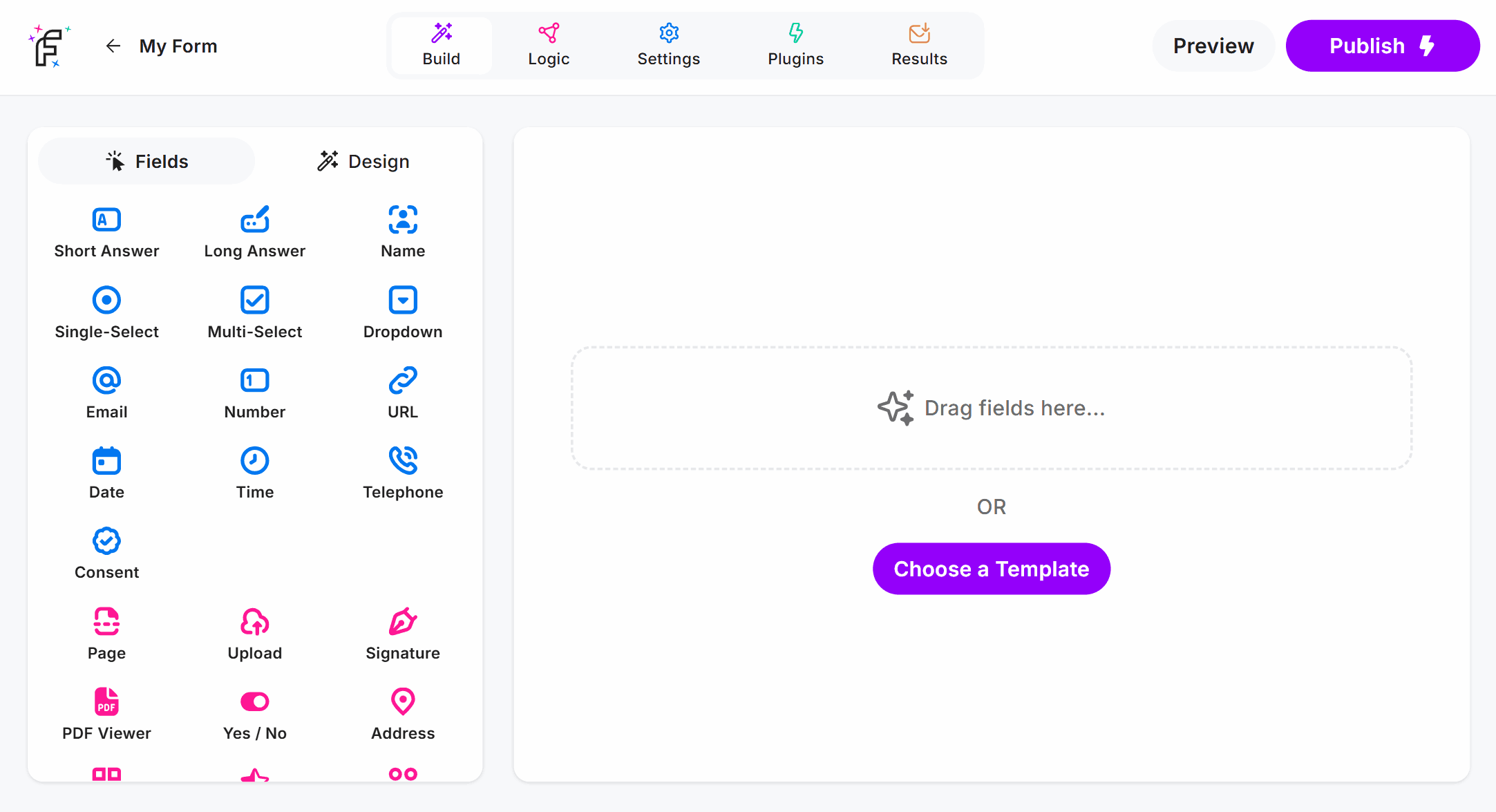
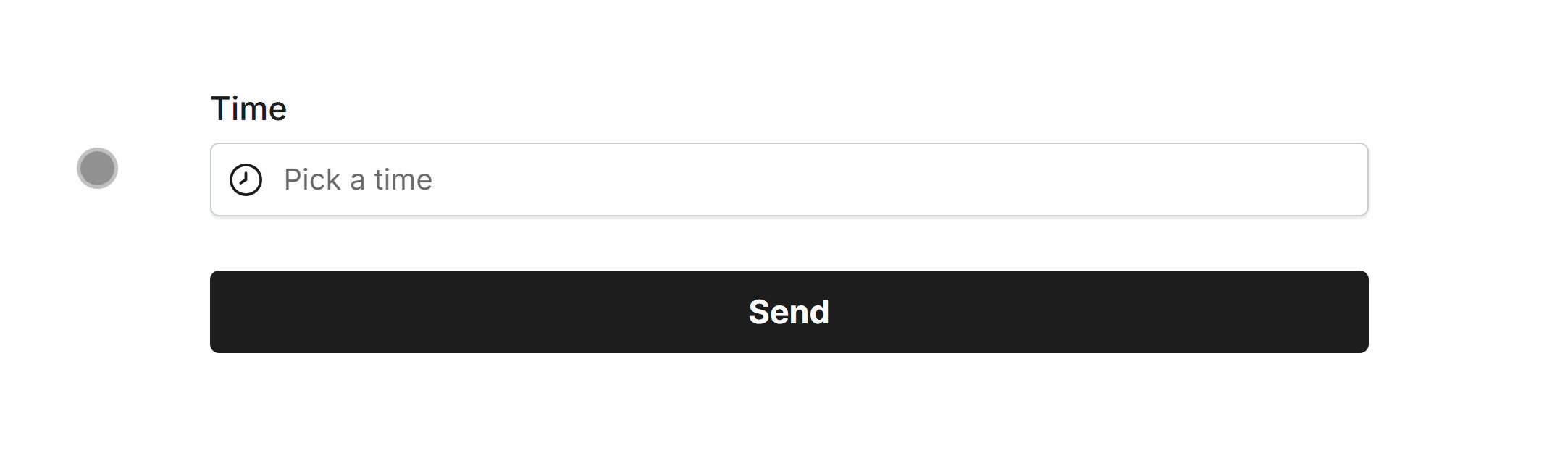
Time Field Demo
Add the Time field and hit Preview or Publish:
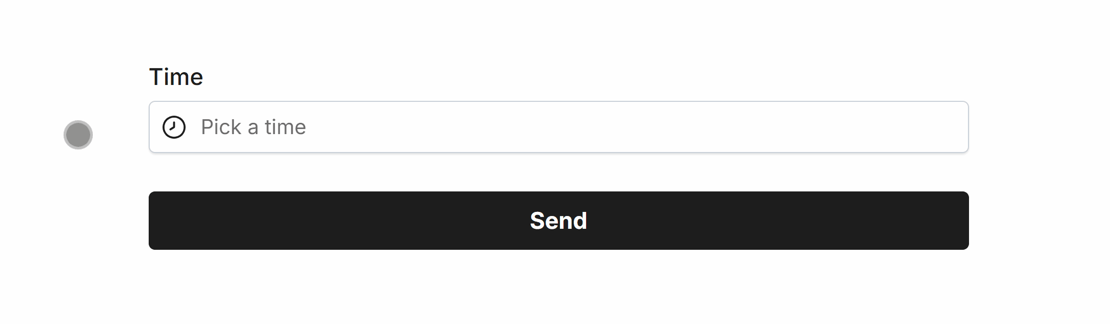
Required Time
Easily make Time required via Smart Validation to ensure the field is always filled out:
Minimum Time
Set a minimum time to prevent selection for a specified time, and prior:
 Minimum Time set to 09:30 AM
Maximum Time
Set a maximum time to prevent selection for a specified time, and after:
 Maximum Time set to 05:00 PM
Specific Options
Configuration options specific to this field:
Time Format | Select a visual time format for the form field |
Min Time | Set a minimum time that can be selected in the picker |
Max Time | Set a maximum time that can be selected in the picker |
Time Step | Minute increments for timepicker (e.g. 15, 30) |
24 Hour Picker | Display the timepicker in 24 hour format |
Common Options
Available on most fields, including this one:
Label | A short description of the field |
Description | An optional longer description of the field |
Required | Enforces the field to be filled in, displays an error if not |
Default Value | Set a default value for the field |
Placeholder | A helpful hint inside the field, e.g. Enter your name |
Read-Only | Locks a field so it cannot be edited, useful when combined with Default Value |
Custom Name | Every field has a unique hidden "name" that can be customized |
The Time field background, selected time, border and text color can be changed within your Theme settings.