 Features
Use the powerful Number field for simple or complex numbers, as well as decimal place.
The
Numberfield automatically rejects any non-numeric characters and limits character input based on theStepvalue, if specified.
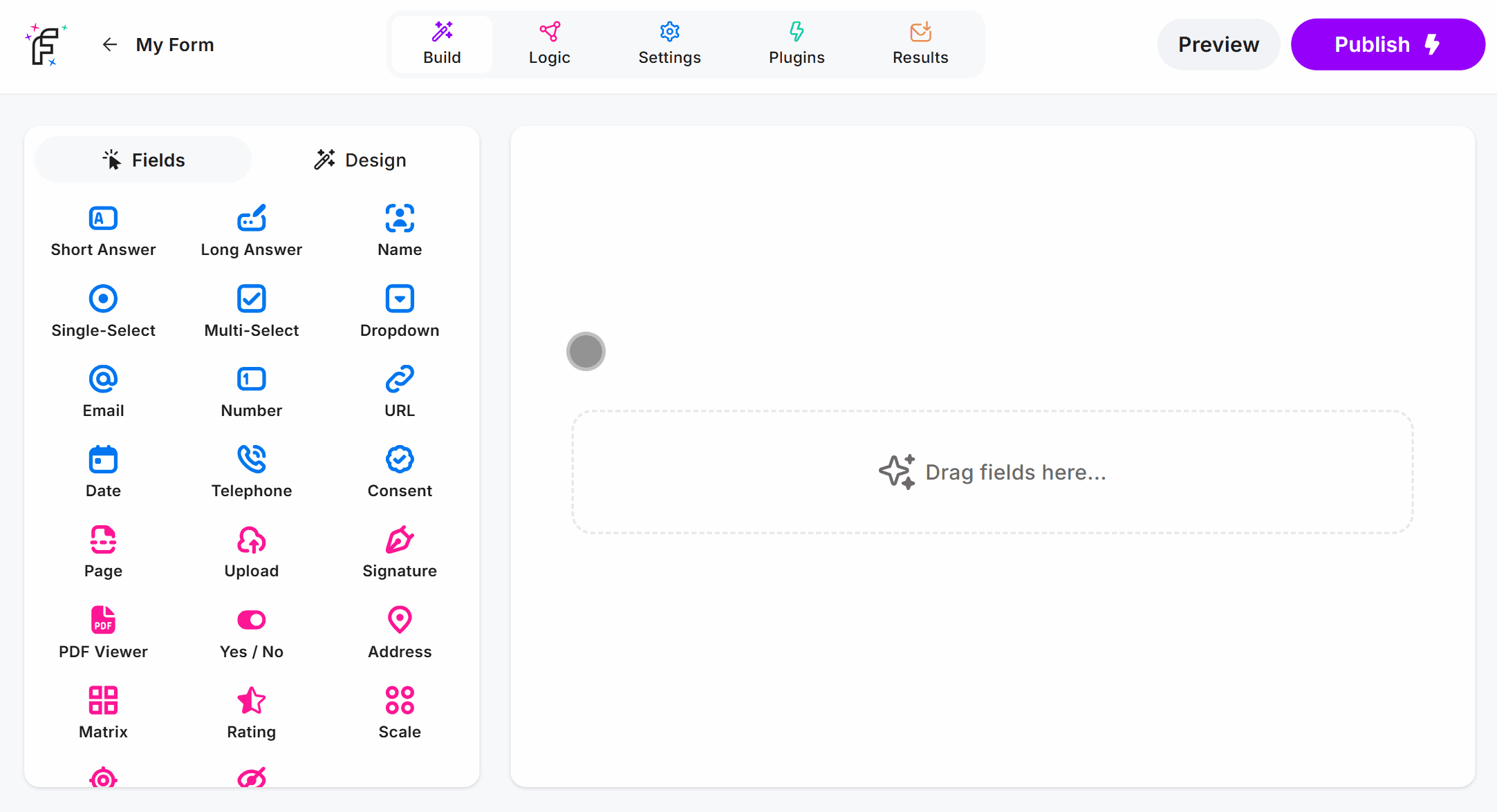
Number Field Demo
Add the Number field and hit Preview or Publish:
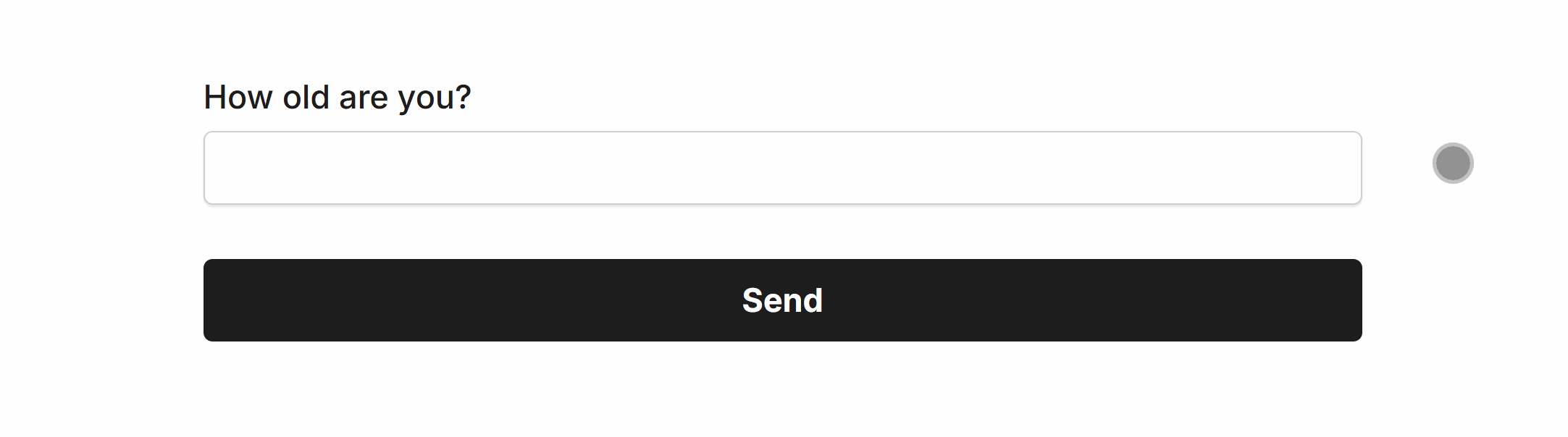
Required Number
Easily make Number required via Smart Validation to ensure the field is always filled out:
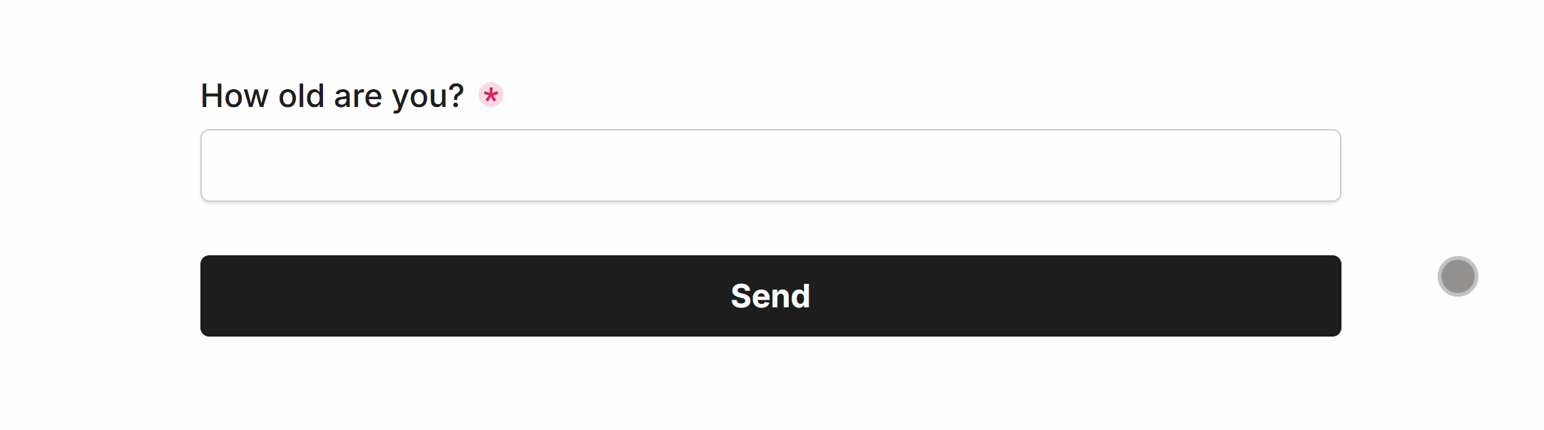
Min and Max Numbers
The Number field supports Min and Max values as demonstrated:
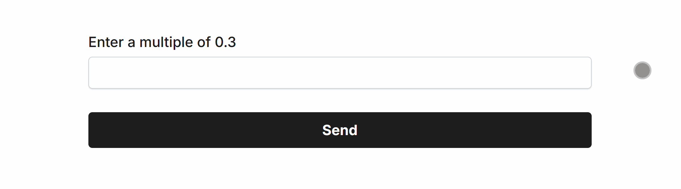
Step Increment / Decimals
You can also provide a Step value to enforce specific numeric increments, and decimal place limits, here’s an example enforcing multiples of 0.3:
Min and Max Length
The Number field also supports Min Length and Max Length input validation, to enforce or limit character counts:
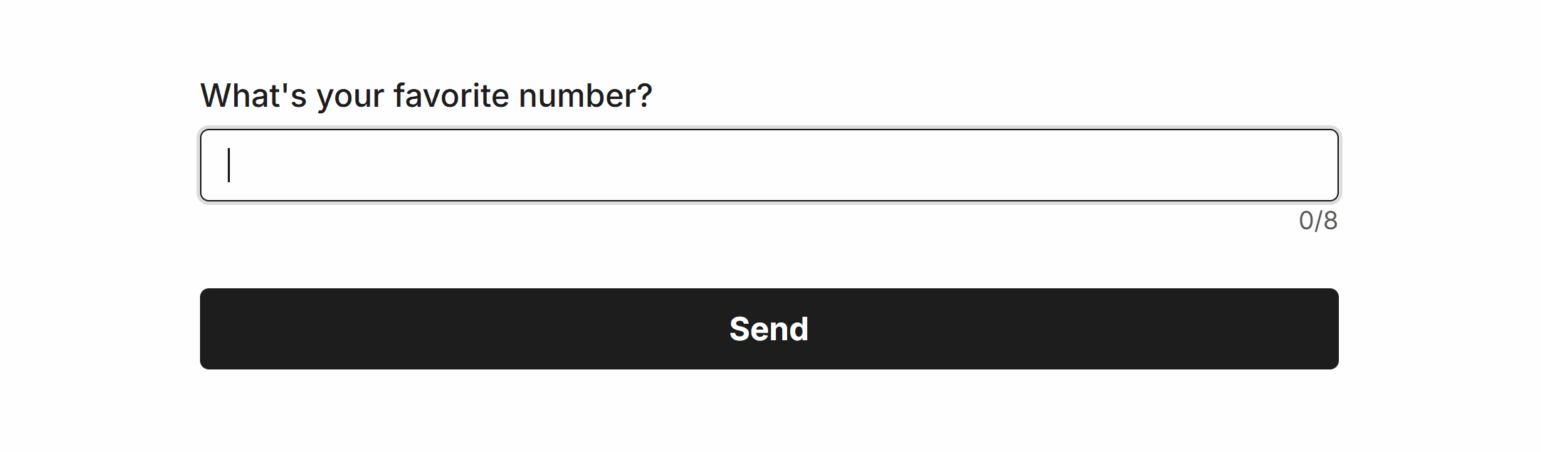 Min Length set to ‘4’ and Max Length set to ‘8’
Specific Options
Configuration options specific to this field:
Min Number | Set a minimum number for this field, errors if too low |
Max Number | Set a maximum number for this field, errors if too high |
Step Increment | Allow only multiples of, e.g. 0.1 or 5. Restricts to decimal places |
Common Options
Available on most fields, including this one:
Label | A short description of the field |
Description | An optional longer description of the field |
Required | Enforces the field to be filled in, displays an error if not |
Default Value | Set a default value for the field |
Placeholder | A helpful hint inside the field, e.g. Enter your name |
Read-Only | Locks a field so it cannot be edited, useful when combined with Default Value |
Min Length | Enforces a minimum character count for this field. |
Max Length | Enforces a maximum character count for this field. |
Custom Name | Every field has a unique hidden "name" that can be customized |